Mastercard dropped its name from its red and yellow circles in selected settings in January 2019. Among the reasons the company gave was a finding from its own research. More than 80% of people recognised the symbol without the word next to it. The announcement gives neither the sample nor the markets surveyed, so nobody else can treat that number as a threshold. What a design team can borrow is the order of events. Mastercard checked what the circles meant to people before asking them to do the work of the name. 1
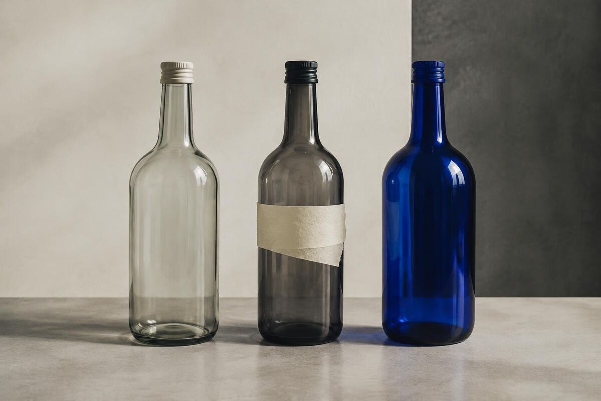
For a smaller business, changing the name, colour, label and description in one go creates a practical difficulty. Suppose a bottled juice company wants to reach restaurants. Its new buyers need a product that looks at home on a dining table. Its old buyers still walk up to a café fridge looking for the little orange cap. Nobody in the design meeting knows whether that cap matters until someone asks the people who buy the juice.
What the buyer already knows
William Caruso, Jenni Romaniuk and colleagues asked 227 marketers about a recent packaging redesign. The projects where teams investigated which visual elements people already associated with the brand tended to have better reported outcomes. Simply doing research had no consistent advantage. The survey relied on marketers describing past work. It could identify a relationship but could not establish that a particular research method caused sales to rise. 2
The same question looks different from the consumer side. In a study published online in March 2026, Caruso and colleagues examined reactions to 48 redesigned packs, drawing on surveys of 484 people in the US and 491 in the UK. In their model, changes in perceived modernity related to purchase intention mainly through familiarity and how much people liked the pack. The researchers measured what people said they would buy. An owner interested in orders still needs evidence from a shop. 3
A brief a designer can act on
In the juice example, write down the commercial change in one sentence. A restaurant buyer should be able to set the bottle on a table and identify the variety when taking an order. That gives the designer two jobs more precise than “make us premium”. Ask a buyer to handle the actual bottle. Does the flavour remain legible in low light? Will staff still know which one is ginger when the bottles are standing in a bucket of ice?
Then do a small exercise with people who buy the category. Include current customers and people who occasionally buy a competitor. Show each person one visual element on its own, without naming your business. Ask which brand, if any, comes to mind. Record the first answer exactly, including competitors and “no idea”. A bright cap that everybody associates with juice is a category signal. A cap people correctly connect to this particular juice is an asset with a different job. With a handful of participants the actual words they use are more informative than a percentage with two decimal places.
Next put the current bottle beside its usual neighbours in a photograph of the fridge. Give another group the same scene with the proposed bottle in its place. Ask each person to find the juice they bought last time. Show prospective restaurant buyers only one version each and ask what kind of place they would expect to serve it, and why. Doing these exercises separately avoids teaching people the answer by showing them the old and new packs side by side. A small trial can uncover an illegible flavour or a lost recognition cue before the business pays for a print run.
The result might be a new label with the orange cap, or a new cap too. If customers consistently find the old bottle by its hand drawn fruit and barely mention the cap, keeping orange because the founder likes it would miss the evidence just as thoroughly as throwing everything away. Ask the designer to show one route that keeps the cue shoppers actually use. Then test a short run with restaurant staff and regular stockists, following reorders and requests for help. The best line in the brief may turn out to be something no one at the studio wrote. It is the phrase a customer uses to ask for a bottle when they cannot remember its name.